When it comes to designing a metal building, the selection of colors plays a crucial role in its aesthetic appeal. Contrary to the myth that metal structures are dull and limited to shades of gray, they can actually embody a wide spectrum of colors, making them just as visually pleasing as any other type of building. By incorporating a color visualizer into the design phase, you can engage in a more interactive process, trying out various color schemes on different sections of the metal building.
In this article, we will explore the various factors to consider when choosing colors for your metal building, popular color choices, the psychology of colors in architecture, and tips for coordinating exterior and interior colors.
Table of Contents:
- Understanding the Importance of Color Selection
- Factors to Consider When Choosing Metal Building Colors
- Metal Building Colors Popular Choices
- The Psychology of Colors in Architecture
- Tips for Coordinating Exterior and Interior Colors
- What’s Next?
- Frequently Asked Questions
Understanding the Importance of Color Selection
Color plays a crucial role in the aesthetics of any building, and metal buildings are no exception. The right color scheme can enhance the visual appeal of your metal building and make it more inviting to both occupants and visitors. Additionally, color can also influence how your building is perceived within its surroundings, conveying a sense of professionalism, avant-garde, or harmony.
The Role of Color in Building Aesthetics
Color selection is an integral part of architectural design. The right colors can highlight architectural features, hide imperfections, or even make your building stand out positively. Lighter colors, such as whites and pastels, can create an illusion of spaciousness, while darker colors give a more imposing and sophisticated appearance to the structure.
Moreover, the psychology of color should not be underestimated. Different colors evoke different emotions and can impact the mood of the building’s occupants. For example, blue is often associated with calmness and productivity, making it a popular choice for office spaces. On the other hand, red can symbolize energy and passion, which might be suitable for recreational facilities or restaurants.
How Color Affects Building Maintenance
Color can also affect the maintenance of your metal building. Lighter colors tend to reflect more heat, reducing the amount of solar radiation absorbed by the building and therefore decreasing cooling costs. On the other hand, darker colors absorb more heat, which can be beneficial in colder climates as they can help retain warmth. However, darker colors may require more regular cleaning and maintenance to keep them looking their best.
Furthermore, the choice of color can impact the longevity of the building’s exterior finish. Some colors are more prone to fading or discoloration due to sun exposure, while others may be more resistant to environmental factors. It’s essential to consider not only the initial aesthetic appeal of the color but also its durability over time to ensure your metal building maintains its visual appeal for years to come.
Factors to Consider When Choosing Metal Building Colors
Several factors should be taken into account when selecting colors for your metal building to ensure a harmonious and functional outcome.
When contemplating the color scheme for your metal building, it’s essential to delve deeper into various aspects that can influence the overall aesthetic and functionality of the structure. By carefully considering these factors, you can create a space that not only looks appealing but also serves its purpose effectively.
Pro Tip:
Before making your final color choice, check with local authorities and building codes. Some areas have restrictions on building colors, especially in historical districts or regions with specific aesthetic requirements.
The Purpose of Your Metal Building
The intended use of your metal building should guide your color choices. For commercial buildings, colors that align with your brand identity can help create a cohesive and professional image. For residential buildings, colors that blend well with the surrounding environment can create a sense of harmony and integration.
Moreover, the psychology of color can play a significant role in the functionality of your metal building. Different colors evoke various emotions and can impact productivity, mood, and even energy levels within the space. Understanding the psychological effects of colors can help you choose a palette that not only looks good but also enhances the intended use of the building.
The Surrounding Environment and Landscape
Consider the natural elements surrounding your metal building, such as trees, fields, or other structures. Take note of the predominant colors in the landscape and choose colors that complement or contrast harmoniously with the surroundings. This can create an attractive and visually pleasing appearance.
Furthermore, incorporating elements of biophilic design into your color choices can establish a deeper connection between the building and its natural surroundings. By selecting colors inspired by nature, you can create a tranquil and inviting environment that promotes well-being and harmony.
Local Climate and Weather Conditions
Climate and weather conditions can impact how your metal building looks and performs. In areas with hot climates, lighter colors can help reflect sunlight and keep the interior cooler. In regions prone to heavy rainfall or snow, choosing colors that can conceal dirt or stains can help maintain the building’s appearance over time.
Additionally, the durability of the paint or coating used on your metal building is crucial in ensuring longevity and protection against the elements. Selecting colors that are fade-resistant and weatherproof can help preserve the aesthetic appeal of the building and reduce maintenance costs in the long run.
Metal Building Colors Popular Choices
When it comes to metal building colors, there is a wide range of options to choose from, ranging from neutral tones to bold and vibrant shades.
Choosing the right color for your metal building is not just about personal preference; it can also impact the building’s energy efficiency. Lighter colors like whites and pastels can reflect sunlight, reducing heat absorption and potentially lowering cooling costs. On the other hand, darker colors absorb more heat, which can be beneficial in colder climates by aiding in heating the building naturally.
Did You Know?
Pre-painted metal panels integrate color directly into the material, ensuring long-lasting vibrancy. Unlike traditional paint, which can fade over time, these panels maintain their color for 30+ years.
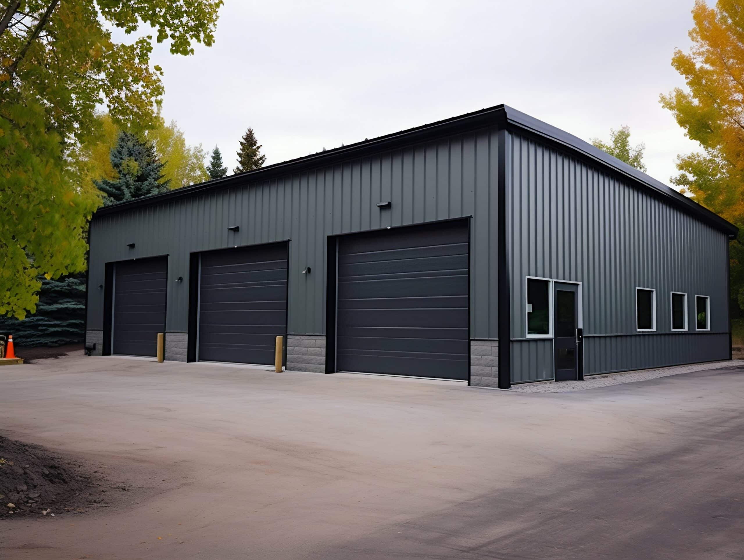
Neutral Colors and Their Advantages
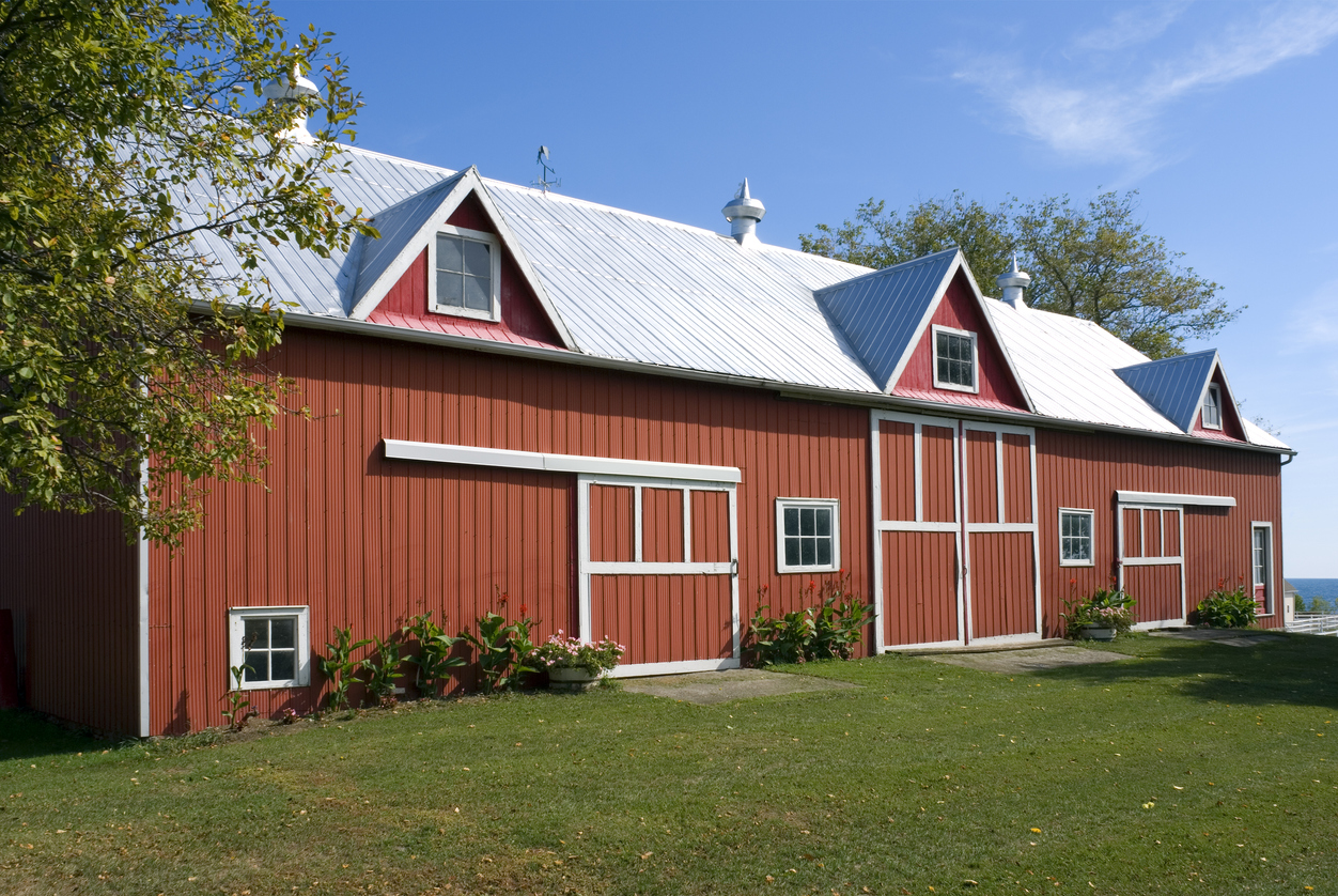
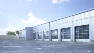
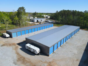
Neutral colors, such as whites, grays, and earth tones, are popular choices for metal buildings. They provide a classic and timeless look that can suit various architectural styles. Neutral colors also have the advantage of being versatile and can easily blend with both natural and urban surroundings.
Another advantage of neutral colors is their ability to hide dirt, dust, and other debris, requiring less frequent cleaning and maintenance compared to brighter hues. This can be particularly beneficial for metal buildings located in dusty or industrial areas.
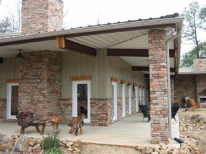
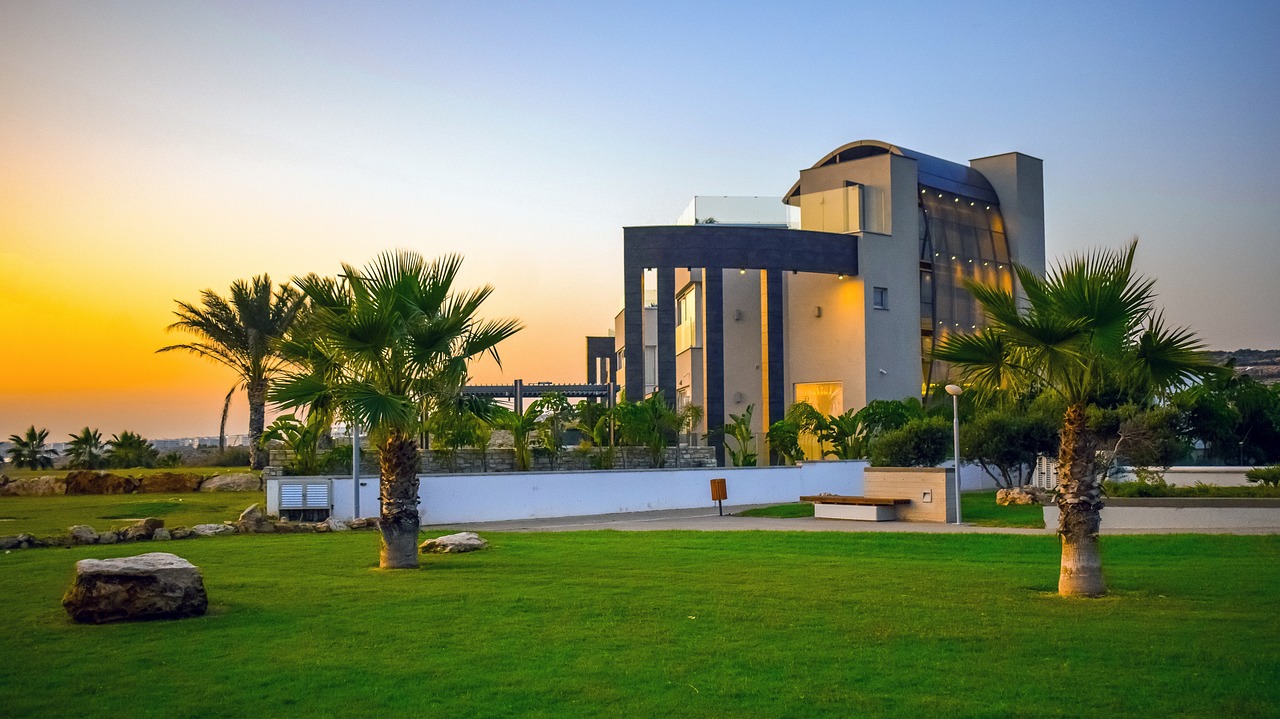
Bold Colors and Their Impact
For those looking to make a statement or create a visually striking building, bold colors like red, blue, or green can be excellent options. These vibrant hues can add personality and allure to your metal building, making it a standout piece within the area.
It’s important to consider the surrounding environment and the intended purpose of the building when choosing bold colors. For example, a bright red metal building might be a striking choice for a modern art gallery but could clash with the serene surroundings of a countryside retreat. Understanding the psychology of colors and their impact on emotions can help in selecting the perfect shade for your metal building.
The Psychology of Colors in Architecture
Colors have psychological effects on individuals and can influence emotions, moods, and perceptions. Understanding the psychology of colors in architecture can help you choose colors that create the desired atmosphere and experience within your metal building.
When it comes to architectural design, color plays a crucial role in shaping the way people interact with and perceive space. The careful selection of colors can impact not only the aesthetic appeal of a building but also the functionality and mood it exudes.
By delving into the psychology of colors, architects, and designers can harness the power of color to create spaces that resonate with occupants on a deep emotional level.
How Colors Can Influence Mood and Perception
Warm colors, such as reds and yellows, can create a sense of energy and excitement, while cool colors like blues and greens can evoke calm and tranquility. By strategically incorporating different colors into your metal building’s design, you can elicit specific emotions and enhance the overall user experience.
Moreover, the saturation and brightness of colors can also impact the way they are perceived.
Bold, vibrant hues can add a sense of dynamism and playfulness to a space, while muted tones create a more subdued and sophisticated ambiance. Understanding how different shades interact with light and space is essential in creating harmonious and visually engaging architectural compositions.
Color Symbolism in Architecture
Colors can also carry symbolic meanings that vary across cultures and contexts. For example, red is often associated with strength and vitality, while blue can evoke feelings of trust and professionalism. Consider the symbolic connotations of different colors and how they align with the purpose and image of your metal building.
Furthermore, the cultural significance of colors can influence the way a building is perceived by different groups of people.
In some cultures, certain colors may hold religious or historical significance, shaping the way individuals interpret and connect with architectural spaces. By taking into account the cultural context in which a building exists, architects can create designs that resonate with diverse audiences and foster a sense of inclusivity and belonging.
Tips for Coordinating Exterior and Interior Colors
Coordinating exterior and interior colors is crucial to achieve a cohesive and harmonious design for your metal building. The right color scheme can enhance the overall aesthetic appeal, create a welcoming atmosphere, and even improve the functionality of the metal building. Here are some additional tips to help you make the most of your color coordination efforts
Achieving Balance with Complementary Colors
Using complementary colors, which are opposite each other on the color wheel, can create a balanced and visually pleasing effect. For instance, if the exterior of your metal building features cool tones like blues, consider incorporating warmer tones like oranges or yellows into the interior to create a sense of harmony and continuity. This color combination can evoke a feeling of balance and create a visually stunning contrast that adds depth to the space.
It’s important to consider the intensity and saturation of the colors you choose. While complementary colors can create a striking effect, using them in their purest form might be overwhelming. To achieve a more subtle and sophisticated look, you can opt for muted or desaturated versions of the complementary colors. This will still maintain a balance while creating a more calming and harmonious atmosphere.
SteelCo offers a color visualizer tool that allows you to see different colors on a metal building design. This resource will give you a better idea of how your preferred color will look on a finished steel structure.
Creating Contrast for Visual Interest
Contrast can bring visual interest and vibrancy to your metal building’s design. Pairing light-colored exteriors with dark-colored interiors or vice versa can create a striking contrast that draws attention and adds depth to the overall aesthetic. However, it’s important to strike a balance between contrast and cohesion. Too much contrast can create a disjointed and chaotic feel, while too little can result in a monotonous and uninteresting space.
Consider incorporating different textures and materials to further enhance the contrast. For example, if your metal building has a sleek and modern exterior, you can introduce textured elements like exposed brick or natural wood in the interior. This combination of contrasting colors and textures will create a visually dynamic space that is both visually appealing and inviting.
What’s Next?
By following these tips and considering the unique characteristics of your metal building, you can create a color scheme that not only coordinates the exterior and interior but also enhances the overall design.
Remember, color coordination is not just about aesthetics; it’s about creating a space that reflects your style, meets your functional needs, and leaves a lasting impression on anyone who enters.
SteelCo has 20+ years of PEMB materials and commercial general contracting expertise taking your projects from concept and design all the way to completion and “certificate of occupancy”. Learn more about our experience in steel building design and design-build services.
———–
Frequently Asked Questions for Metal Building Colors
Why is choosing the right colors for a metal building important?
Colors can significantly impact a building’s aesthetics, functionality, and maintenance requirements.
How can colors affect the aesthetics of a metal building?
Color selection can highlight architectural features, hide imperfections, create an illusion of spaciousness, and convey a specific style or mood.
What role does color play in building maintenance?
Lighter colors can reflect heat, reducing cooling costs, while darker colors absorb more heat and may require more frequent cleaning.
What factors should be considered when choosing colors for a metal building?
Consider the purpose of the building, the surrounding environment, local climate, and personal preferences.
What are some popular color choices for metal buildings?
Neutral colors like whites, grays, and earth tones are popular for their versatility and timeless look.
How can I visualize different colors on a metal building?
SteelCo offers a color visualizer on our 3D modeling tool that allows you to see different colors on a Metal building design.
Why should you choose a Metal building color scheme?
Choosing a metal building color scheme is more than just an aesthetic consideration; it’s an important decision that can have practical implications for your building’s performance and lifespan.
Can you change the color of a metal building?
You can change the color of a metal building in a few ways: paint it, use powder coating, apply vinyl wraps, or replace the metal siding. Painting with special paint for metal is simple, while powder coating needs a controlled environment but lasts longer. Vinyl wraps offer a fast color change, and swapping out the metal panels gives a complete makeover. Each method has factors like cost and durability to think about. It’s wise to talk to pros to follow rules and get the outcome you want.
What is the best color to paint a commercial building?
The best color to paint a commercial building depends on various factors such as the type of business, target audience, and surrounding environment. However, neutral colors like white, gray, and beige are often recommended for their professional look and ability to attract a wide audience. These colors also offer the advantage of making the building appear larger and more inviting.